Client Overview
This information architecture analysis and redesign was a community outreach initiative for the BATA Shoe Museum, North America's only museum dedicated to the history of footwear. The museum offers exhibitions, lectures, performances, and events that are available for public and educational engagement. In addition to a popular Toronto tourist attraction, the museum is also concerned with acquiring, conserving, researching, and exhibiting footwear artifacts. This allows researchers to understand the social and cultural constructs surrounding the artifacts in question.
The website serves to increase awareness and engagement with the museum, showcasing present and upcoming exhibits, managing admission and ticket purchases, and connecting with the community and institutions for collaborative events.
Executive Summary of Audit
At the time of this audit, the BATA Shoe Museum sported relatively simplistic information architecture with several patchwork formatting structures. Such structures included text uploaded as images and non-uniform placement of images in relation to their respective titles and headings. The waterfall style of primary navigation menu belied an excessive volume of information on the site, which becomes more apparent the more specific a user task becomes.
We found, in our audit, that tasks as simple as returning to the homepage were made difficult from a lack of consistent home navigation or, indeed, a universal navigation bar. Depending on where the user goes, the formatting and colour of the universal navigation bar changes, and some links become unresponsive.
The navigation behaviour at the time of the audit required users to click the discover submenu, yet the main label is not intuitive in its description. The requires the user to take extra steps while unsure of exactly where navigation will lead them. Users have no way of discerning where they are or how to navigate elsewhere.
My Work
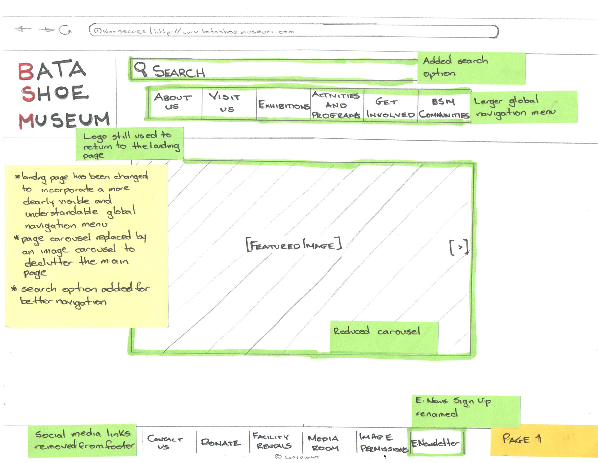
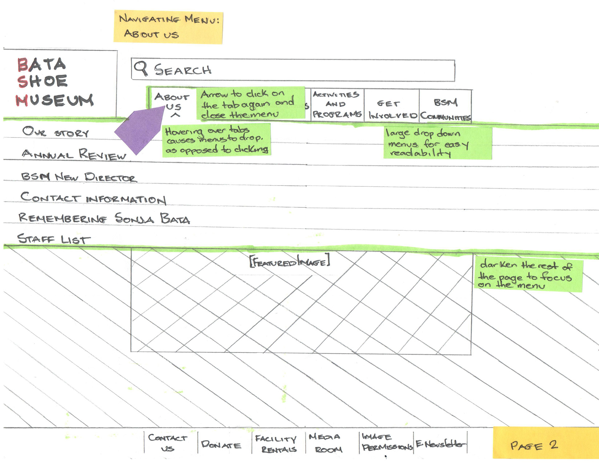
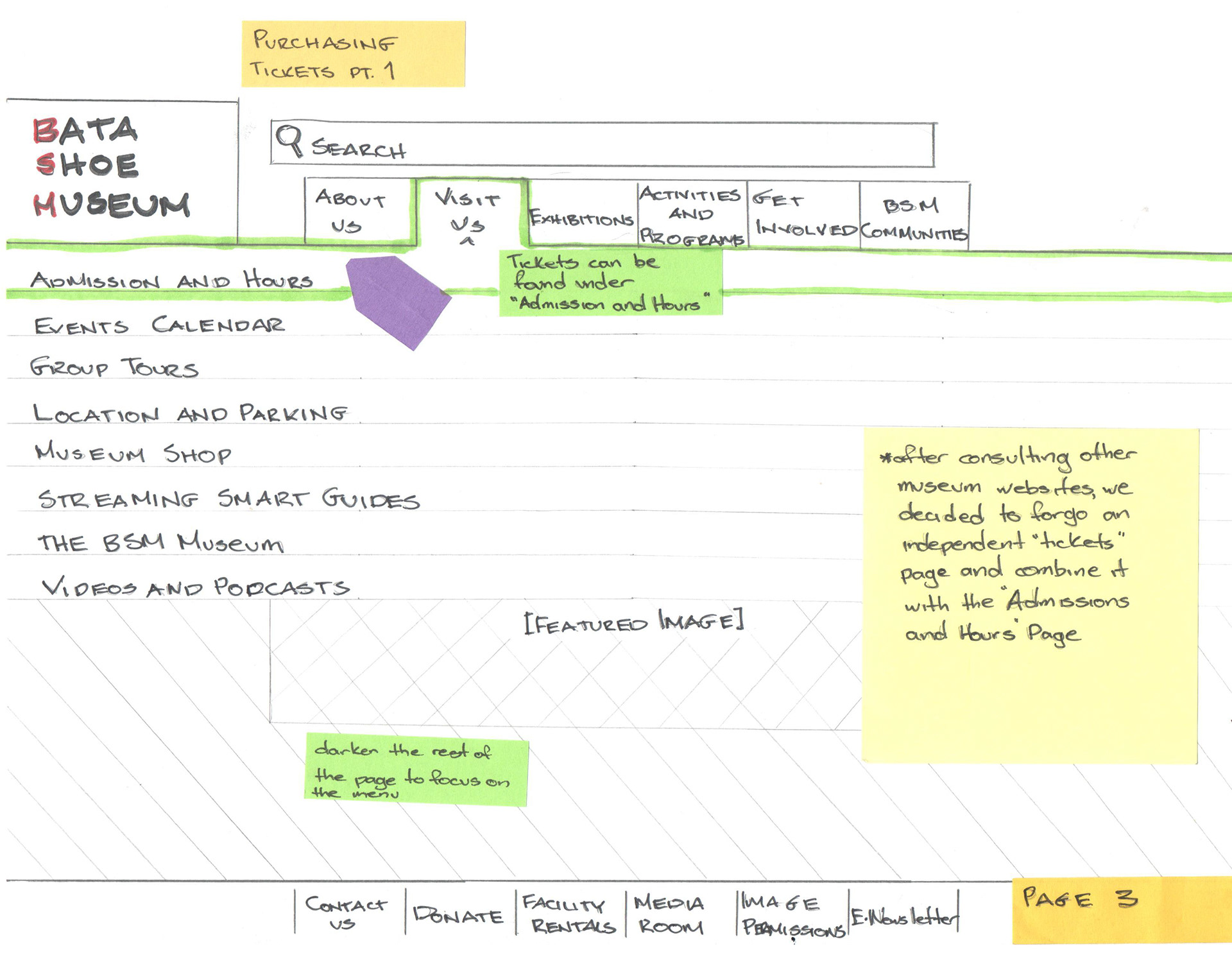
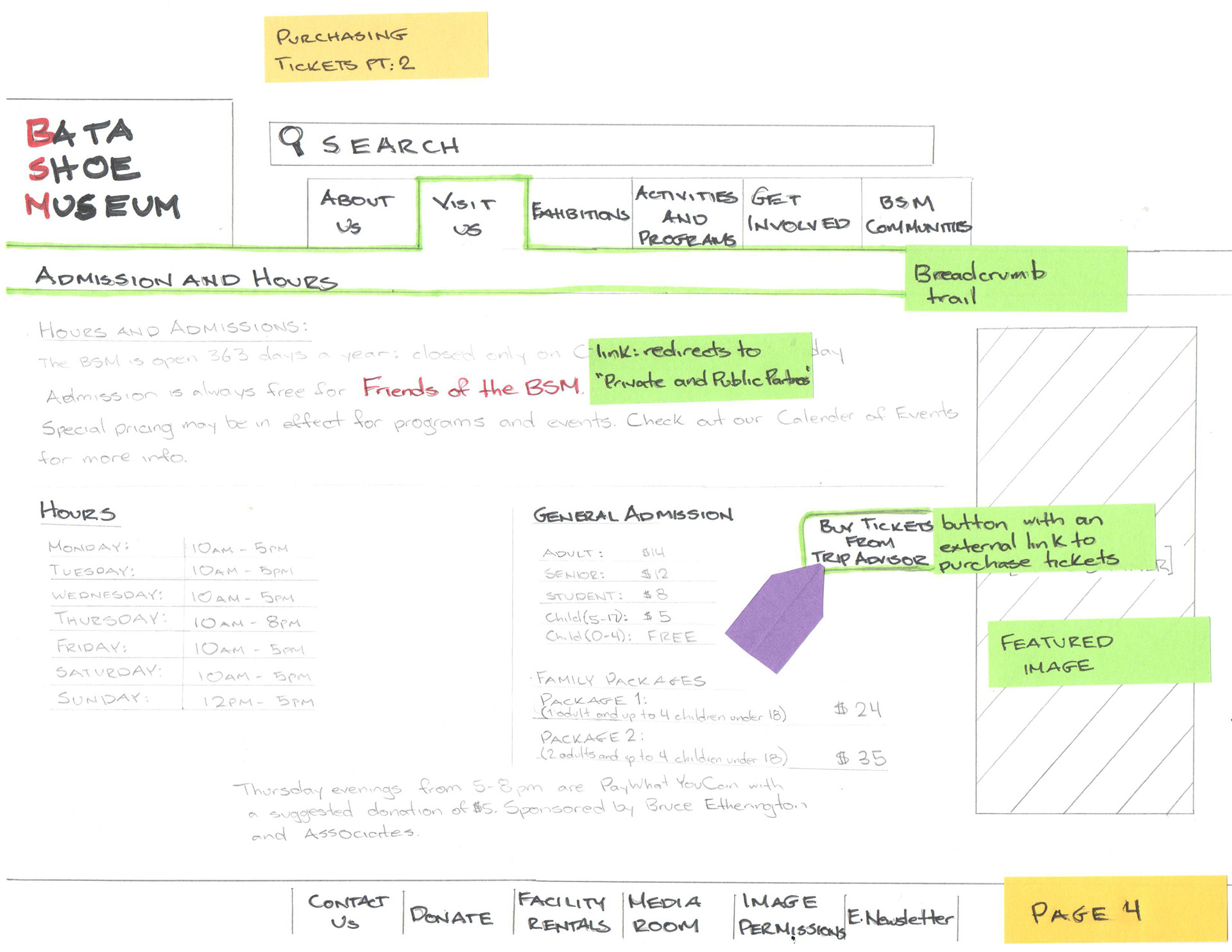
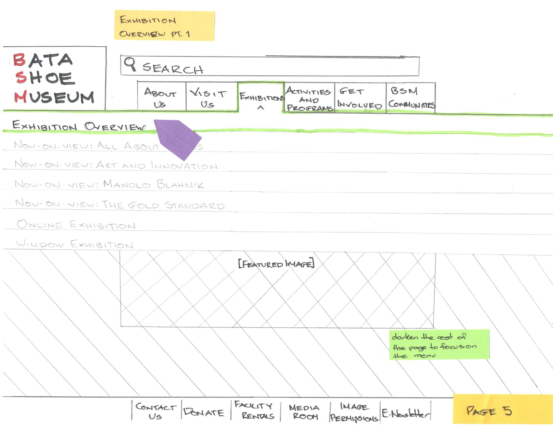
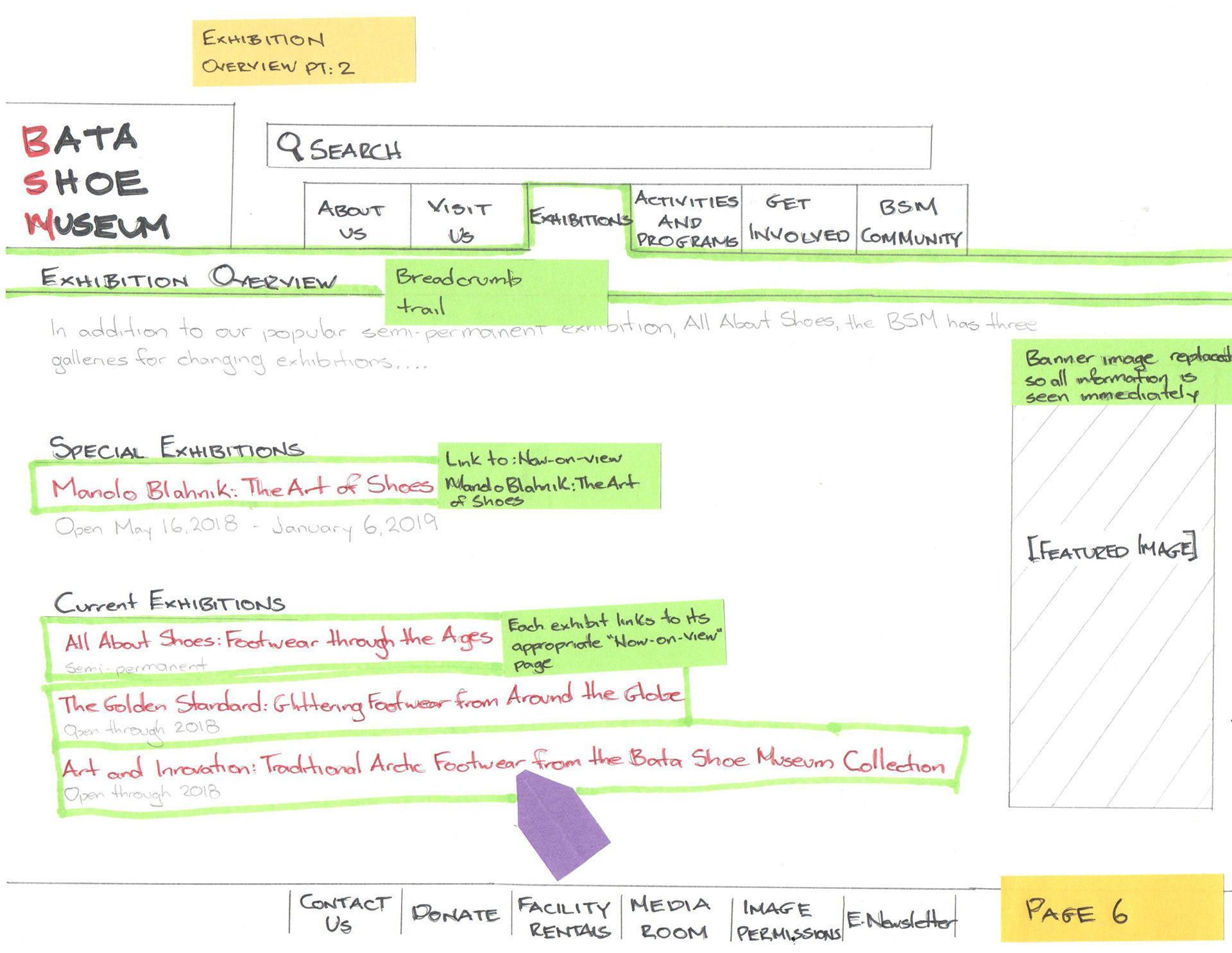
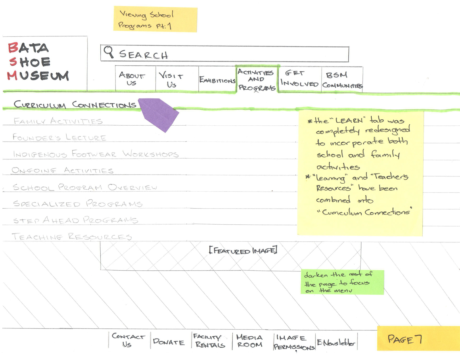
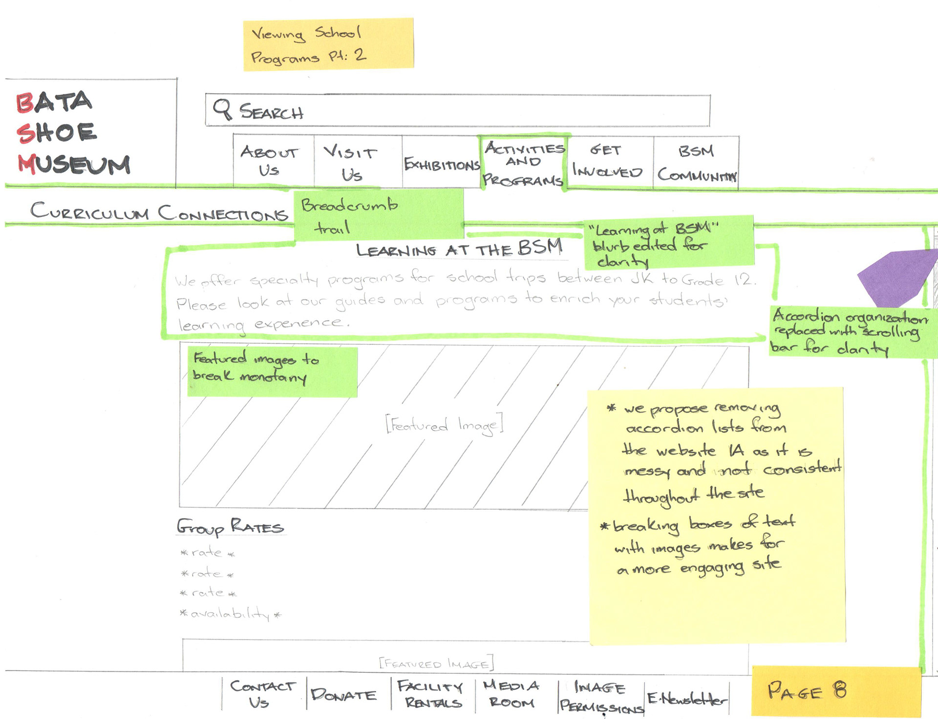
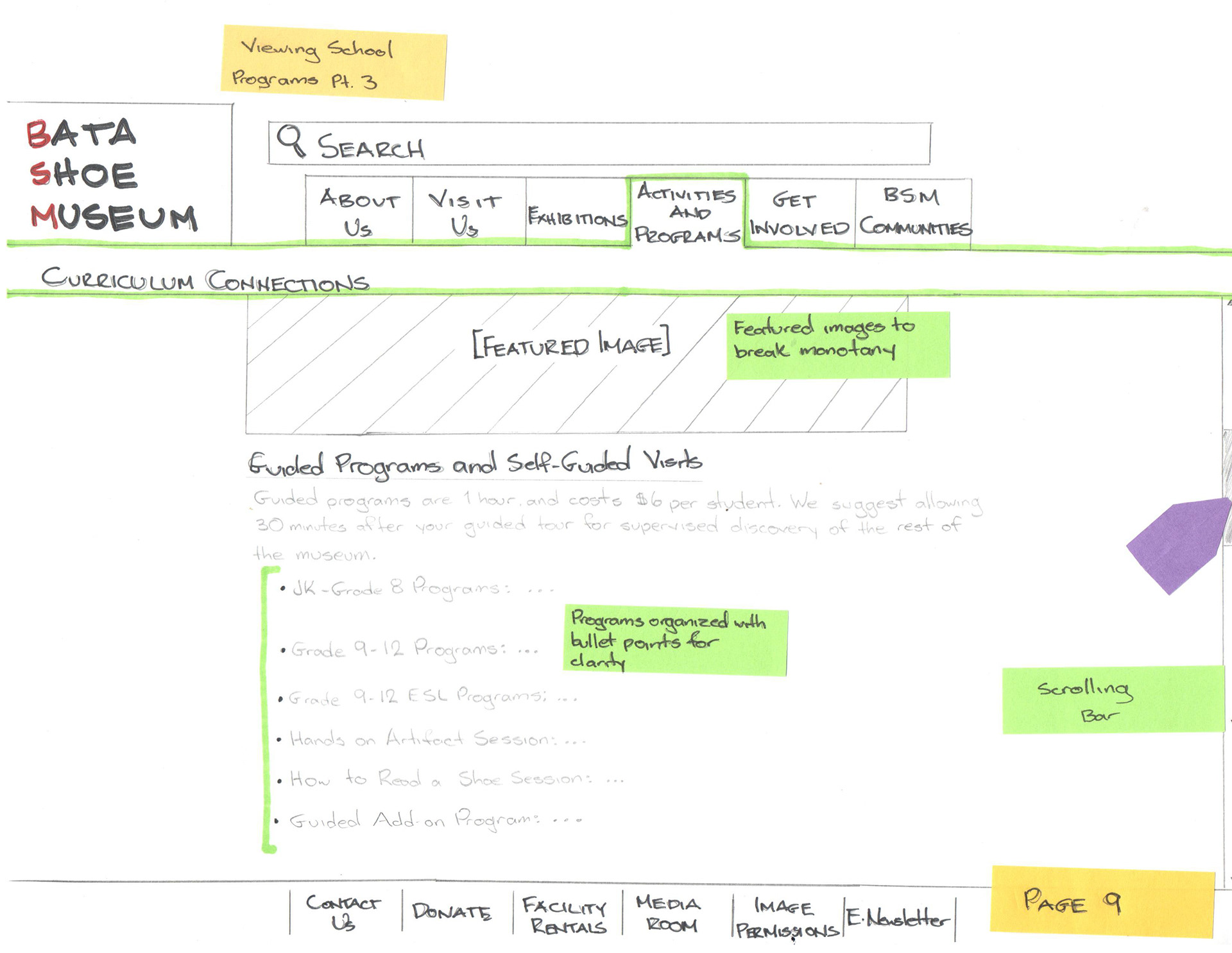
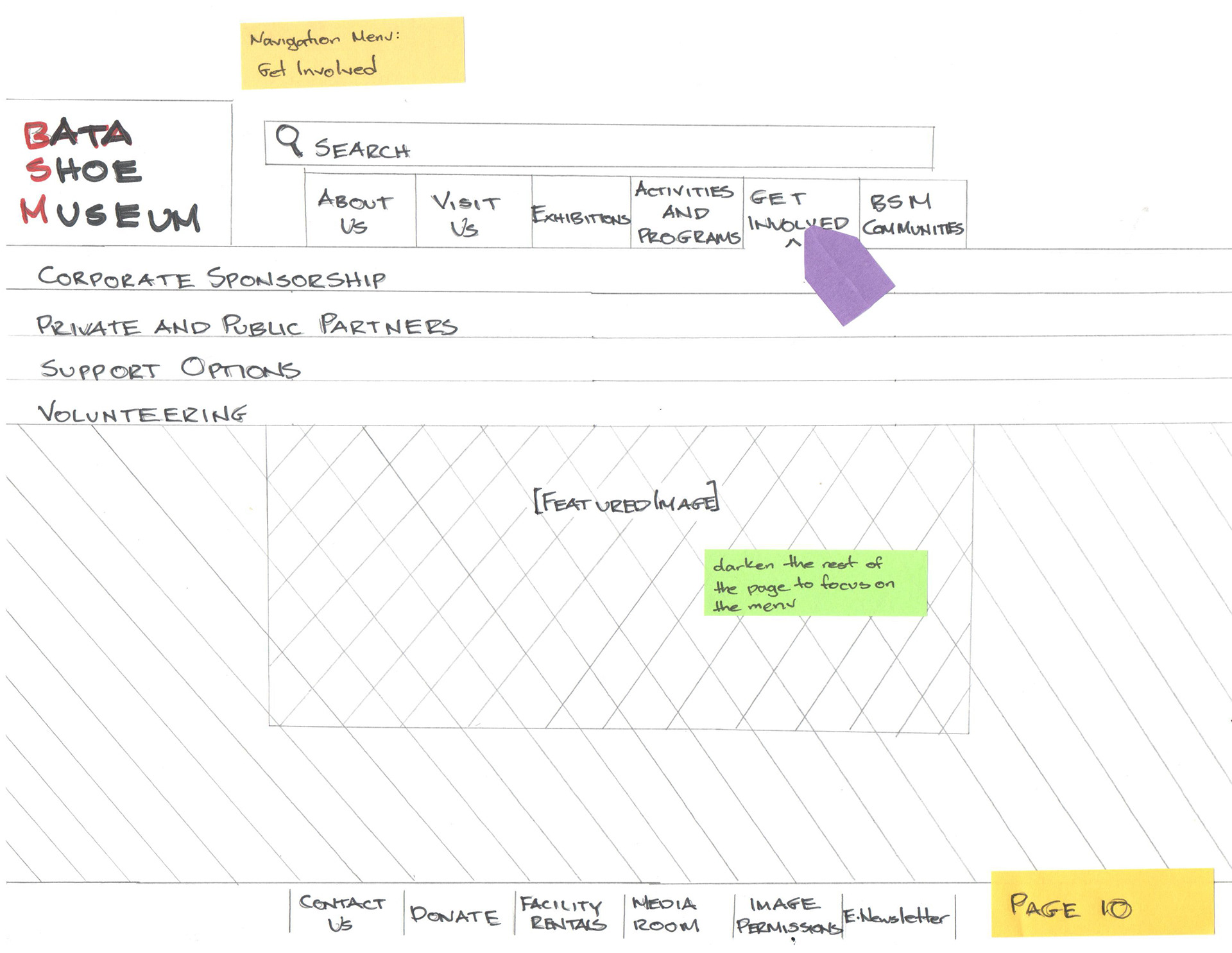
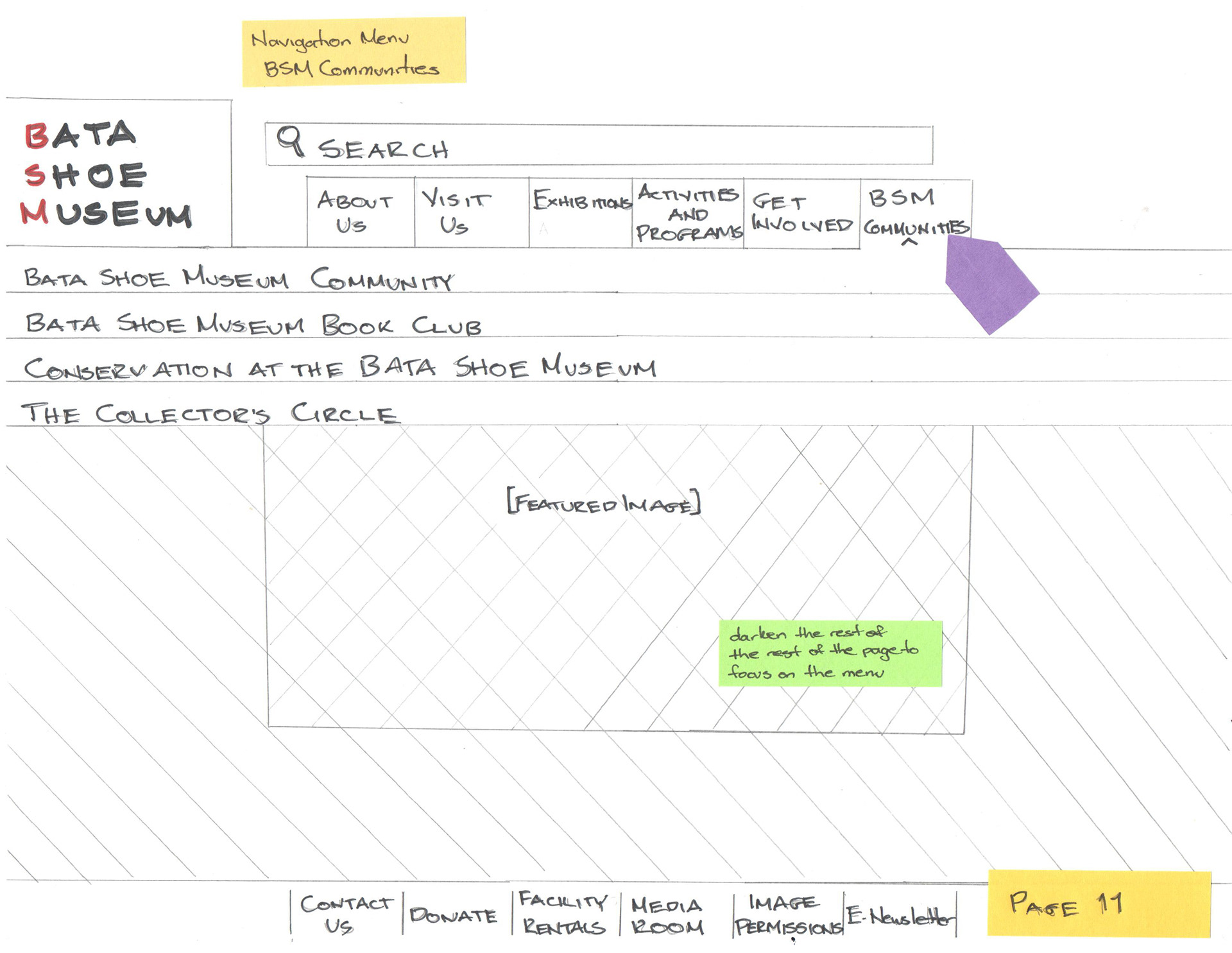
The focus of my work for this project was the initial audit of and redesign of our main user tasks. These tasks are are as follows: the breakdown of the global navigation menu; finding where to purchase tickets; finding featured exhibitions; and finding information on school activities.
Global Navigation Menu Breakdown
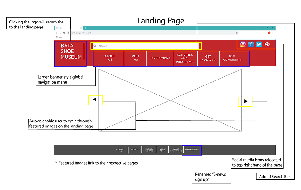
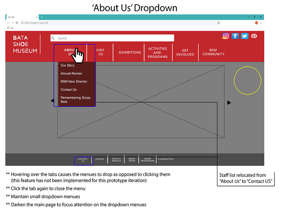
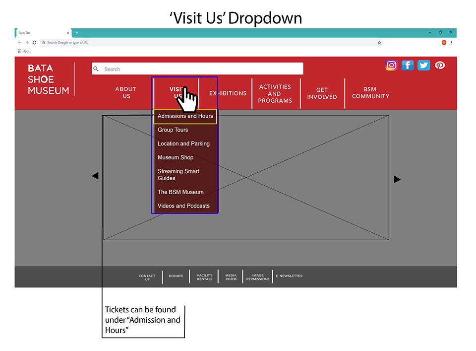
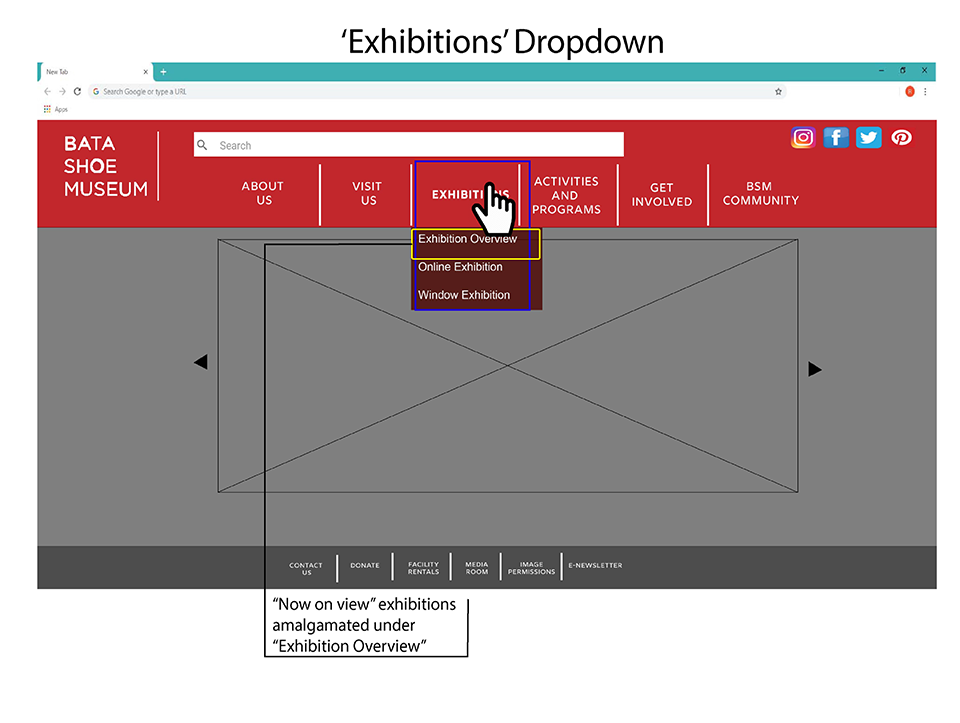
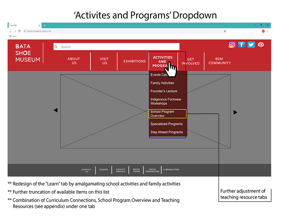
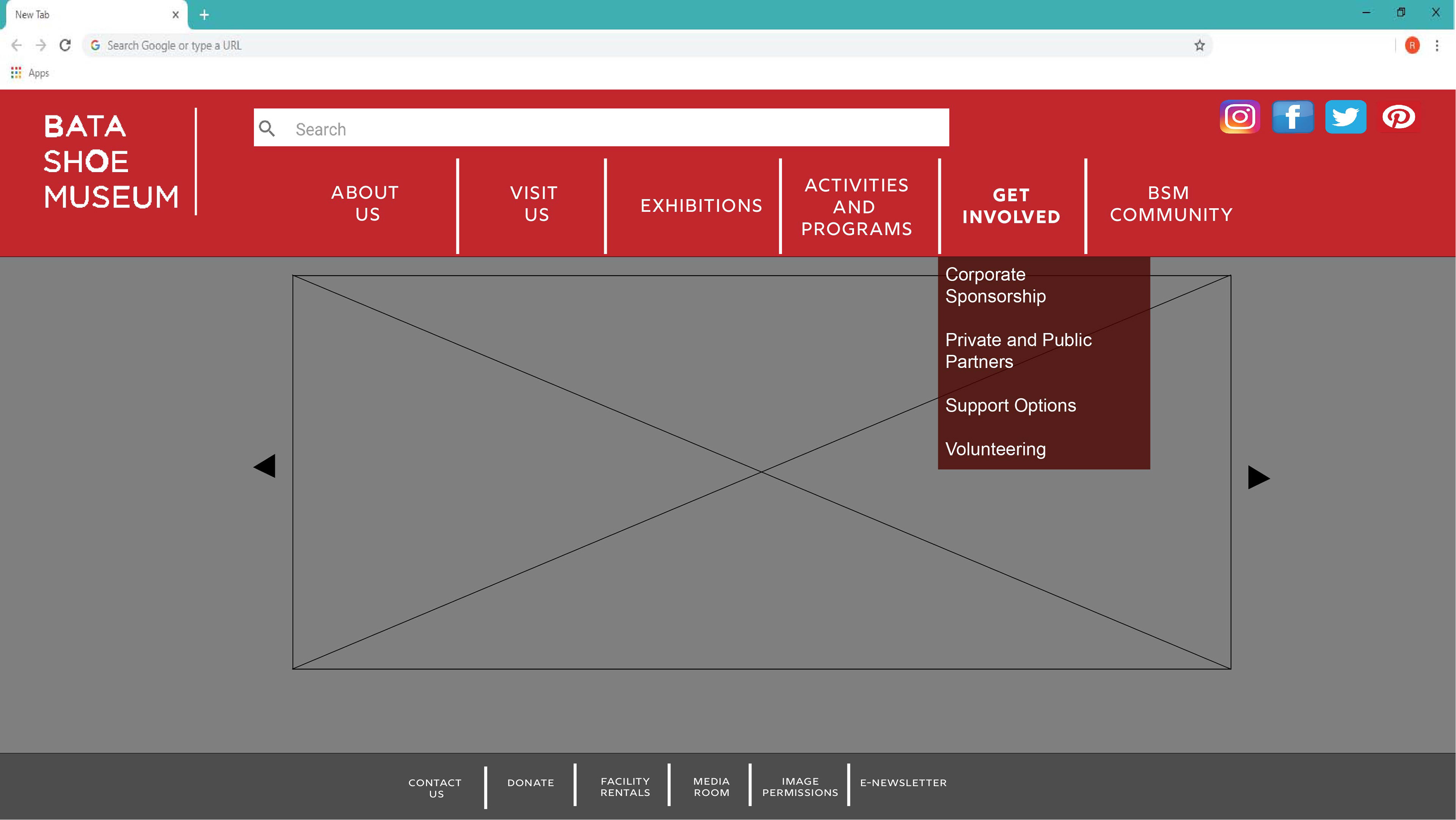

I redesigned the global navigation menu as a banner style navigation bar at the top of the screen, while still featuring the carousel, which now allows users to cycle through hyperlink images. Additionally, I redesigned three user tasks, outlined below in sequential storyboards.
Purchasing Tickets
Finding Feature Exhibits
Finding Information on School Activities
Software Used:
Adobe Illustrator
Adobe Photoshop

